|
|
|
| This document is available in: English Castellano ChineseGB Deutsch Francais Italiano Nederlands Turkce |
![[Photo of the Author]](../../common/images/katjasocher.gif)
by Katja Socher <katja(at)linuxfocus.org> About the author: Katja is the German editor of LinuxFocus. She likes Tux, film & photography and the sea. Her homepage can be found here. Content: |
![[tuxswithsunflowers]](../../common/images/article238/tuxswithflowers3.jpg)
Abstract:
In this article I give some examples how you can easily create
nice pictures using dingbats and The Gimp. The version of Gimp
that was used for this article is Gimp-1.2.2.
Probably you have already come across dingbats when you used the text tool of Gimp. Dingbats are fonts. When you were trying out several fonts you probably came across some fonts called e.g. dingbats, davysdingbats or davysotherdingbats that weren't normal letters but small sketches of flowers, a piano, animals etc. Perhaps you have wondered then what you could do with them. But usually when you are using the text tool you want to include some text and later when you are looking for cool motives you have already forgotten about them. But think again. They can really help you create very nice looking pictures in a short time and you also don't need to be very talented in drawing for this.
In this article I will mainly use dingbats that are included
in the sharefonts package (davysdingbats, davysotherdingbats..)
as I think that many of you will already have them installed on
their computer but I will also show you a few icons of other
dingbats that I found exciting. There are really tons of cool
and exciting dingbats out there that you might want to
install.
You can download the sharefonts from http://ibiblio.org/pub/Linux/X11/fonts/
and you find a collection of other dingbats at http://www.fontguy.com.
Read André Pascual's article on Freefont, TrueType and
patterns with The Gimp to find out how to install them.
![[DynamicText]](../../common/images/article238/screen_dynatext.gif)
Of course you can use the normal text tool but there is a
special tool called GDyntext which is preferrable here. You
will find GDyntext when you right click in an image
Filter --> Render --> DynamicText
By using it you can preview the icons and then select the
one(s) you want with the mouse (in the same way as you copy
& paste something) or if you know the key you can also type
it in directly.
In the default setting the tool already shows you the letters
of the alphabet with small as well as with capital letters. But
sometimes there are a few more icons available that you e.g.
get if you press some special characters.
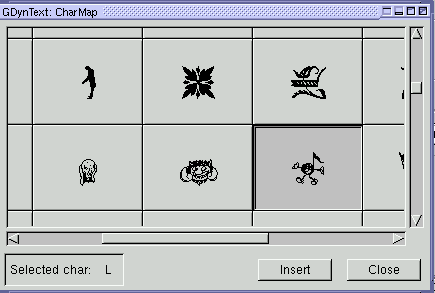
Another way to insert your icons (and the one I prefer when I
am looking for new icons) is to use the CharMap window which
you get by pressing on the button that is the most right in the
top row in the GDyntext window. In the charmap you can see all
available characters of a font and can insert them in your
image. Left at the bottom there is also a small field where you
can see which key it is.
With GDyntext you can also scale the size of the icon which can
be much bigger here than the available size in the text tool.
So you may also want to use GDyntext if you need some text in a
very big size.
You can also set the color you want your dingbats to have as
well as rotate it or determine where in the image it shall be
positioned. At first the color is the same as the foreground
color in the main menu of The Gimp but when you change it
afterwards it doesn't have any effect and you can also choose a
color in the tool itself.
The only disadvantage that you have with this tool is - at
least at my computer (I am using Gimp1.2.2 on a Mandrake8.0) -
that it sometimes manages to crash Gimp when I have loaded all
the tons of special fonts.
Perhaps you have taken a look at the dingbats by now. Of
course there are a few icons like e.g. the grand piano you may
want to use just as they are without any changes:
![[grand piano]](../../common/images/article238/grandpiano.jpg)
![[pandas]](../../common/images/article238/pandas.jpg)
![[dolphin]](../../common/images/article238/dolphin.jpg)
![[penguins]](../../common/images/article238/penguin.jpg)
![[rose]](../../common/images/article238/rose.jpg)
![[violins]](../../common/images/article238/violins2.jpg)
![[easter]](../../common/images/article238/easter.jpg)
![[smurf]](../../common/images/article238/smurf.jpg)
![[Gradient Button]](../../common/images/article238/screen_gradient_button.gif)
Often an icon will already look very good if you fill it
with a gradient or if you use a gradient as background.
To use gradients in Gimp is very easy. To get a gradient with
just two colors choose the two colors that you want as
background and foreground colors. Now doubleclick on the
gradient button (in the main window, see screenshot on the
right). The option under Blend should say: FG to BG (RGB). Now
draw a line with the mouse from the right to the left side of
your picture and the image is filled with a gradient. The
options under "gradient" determine how the colors of the
gradient will run (e.g. linear). By varying the direction or
the length of the line you draw with the mouse you also
influence how the gradient will look on your image. Of course
you can also use gradients with more than two colors. Click on
File (in the main menu of Gimp)-->Dialogs-->Gradients and
you can see a big selection of gradients. If you want to use
one of them just click on it to select it. Then go back to the
gradient button and again double click on it. The Blend option
must now be "Custom Gradient". Then do as before and draw a
line with your mouse over the image and it is filled with the
gradient.
Of course you can also define your own gradients. To do so click again on File-->Dialogs-->Gradients and choose a gradient that comes closest to the one you want to design. Then click "Edit". A new window opens. Click here "Copy Gradient" and name it as you like. Now you can see it in the list of gradients but it still looks identical to the other one. We are now going to edit it. Remain in the window "Gradient Editor". At the bottom you see a big band with the colors of the gradient. Below is a line where you can see some triangles. Between two black triangles is a section and you will always change one section in one go. To make a section bigger you can just drag the triangles to the point where you want them to be. The colors of the area that has a darker gray can be changed. Click in the band with a right mouse click and hold it. There are several options you can choose now: You can see "Left endpoint's color" and "Right endpoints' color". If you go to them with the mouse you will get a color circle and can choose a new color. The endpoint of one section should have the same color as the starting point of the adjacent section if you want a smooth picture. Of course this is not true if you want to have clear borders of color changes. By clicking on "Blending function for section" you can say whether the color should run linear, in a circle etc. By clicking "Split segments at midpoint" you can split the section into smaller parts.
Let's have a look at some nice pictures now:![[trompet]](../../common/images/article238/trompet.jpg)
![[rabbitonhat]](../../common/images/article238/rabbitonhat.jpg)
![[sunflower]](../../common/images/article238/sunflower.jpg)
![[comeandjointhefun]](../../common/images/article238/comeandjointhefun.jpg)
![[buttonwithmouseandco]](../../common/images/article238/buttonwithmouseandco.jpg)
Script Fus are scripts so that you can get an effect in one click for which you usually would need several steps. You can get the Script Fus either by right clicking in an image or a click on Xtns (next to File on top in the main window of the Gimp). It is said that you should use the right click in the image to work with already created images while by clicking on Script-fu over Xtns you can create a new image and determine which text font and color to use and which text to write.
Let's look at some pictures:![[rosewithchrome]](../../common/images/article238/rosewithchrome.jpg)
![[grandpianogradientbevel]](../../common/images/article238/grandpianogradientbevel.jpg)
![[catglossy]](../../common/images/article238/catglossy.jpg)
![[pianoplaying]](../../common/images/article238/pianoplaying.jpg)
![[happybirthday1]](../../common/images/article238/happybirthday2a.jpg)
![[penguinsframe]](../../common/images/article238/penguinsframe.jpg)
![[sunflowerswithcats]](../../common/images/article238/sunflowerswithcats.jpg)
![[meadow]](../../common/images/article238/meadow.jpg)
![[flowermeadow]](../../common/images/article238/flowermeadow.jpg)
|
|
Webpages maintained by the LinuxFocus Editor team
© Katja Socher, FDL LinuxFocus.org Click here to report a fault or send a comment to LinuxFocus |
Translation information:
|
2002-03-07, generated by lfparser version 2.27