|
|
|
| This document is available in: English Francais |
![[Photo de l'Auteur]](../../common/images2/JeanEtiennePoirrier.jpg)
by Jean-Etienne Poirrier About the author: Jean-Etienne Poirrier is a PhD student at the Université de Liège, Belgium. He is studying memory consolidation in animals. He is also interested in free software and Open Access. Content: |
Automate the creation of graphs with GraphvizAbstract:
In this article, we'll learn how to create a few simple graphs with graphviz, a command-line open source graph visualization software.
|
We all have wanted to draw, one day, a simple graph linking two concepts, a diagram representing a process, a database structure, a computer network or any other relations. Graphviz (http://graphviz.org) [1] is an open source graph visualisation software: it will help you to represent such structural information. It's a powerful tool, working with special algorithms in order to render the best graph possible.
Another advantage is that it's a command-line tool. You will be able to generate a graph from one simple command, a huge text file or automatically from data generated with another process. Graphviz can be used with interactive tools to generate those graphs but it's not intended to be like MS-Visio or Smartdraw.
Graphviz is composed of two main tools: dot and neato. Each of them has a speciality, as we'll see below ... This small article will focus on these two command-line tools with data you provided but you can use these tools from a web server, another software, etc..
Installation of Graphviz is very easy since many GNU/Linux distributions include it, in one way or another. For example, if you run Debian, you can install it with this command:
# apt-get install graphviz-doc
If you run Fedora Core 3 (like me), you can add the Extra repository [2] and then type this command:
# yum install graphviz-2.2-3
If you have another distribution, you should look for Graphviz in its software repositories.
Finally, you can always install Graphviz from sources after having downloaded them [3]. After accepting the licence, you'll be able to download the source code or executable packages for Apple, MS-Windows, Sun Solaris, etc.
One last word about the licence: for version above 1.3, it's the Common Public License Version 1.0 [4], a free software licence (but not compatible with the GNU GPL).
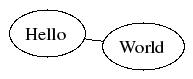
Whether you've learned a programming language or not, you should probably know that one of the first thing you learn is to display the "Hello World!" string. We will not depart from good old habits, here is how to display it with the dot tool:
echo "digraph G {Hello->World}" | dot -Tpng >hello.png
The result is:
![[Hello World with dot]](../../common/images2/article387/hello.png)
This is the first way of drawing a graph: printing the commands and redirecting them to dot. The -Tpng option tells dot to write the output as a PNG file. Of course, you can use many output format like JPG, SVG, Postscript (and thus PDF), etc.
The command is rather simple to understand. With dot, we are drawing directed graphs: they have a direction, we get arrows between the nodes. For that purpose, we used the keyword "digraph" and we named this graph "G". Between the brackets, we put everything that's included in the directed graph: two nodes ("Hello" and "World") and an arrow (or "edge") from "Hello" to "World". Easy, isn't it?
The second way of drawing a graph is by using a text file and the command line. To understand the advantage of writing everything in a text file, let's take another example.
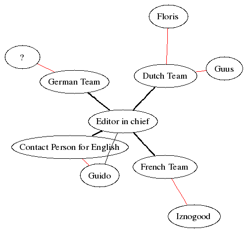
If we look at the contact list for LinuxFocus [5], we see that there is one Editor-in-chief and many people responsible for a language team. Here is a summary of the data we'll need to create our diagram (I only used first name for the simplicity):
| Team/Role | Person |
|---|---|
| Editor-in-chief | Guido |
| French Team | Iznogood |
| Dutch Team | Floris and Guus |
| Contact person for English | Guido |
| German Team | ? |
Using a semicolon to separate linked nodes, I can write a simple text file summarising the relations:
digraph G {
  EditorInChief -> Guido;
  EditorInChief -> FrenchTeam;
  EditorInChief -> DutchTeam;
  EditorInChief -> ContactPersonForEnglish;
  EditorInChief -> GermanTeam;
  FrenchTeam -> Iznogood;
  DutchTeam -> Floris;
  DutchTeam -> Guus;
  ContactPersonForEnglish -> Guido;
  GermanTeam -> Unknown;
}
We save it with the name "lf-hierarchy1.dot", run the command "dot -Tpng lf-hierarchy1.dot -o lf-hierarchy1.png" and we get this wonderful graph:
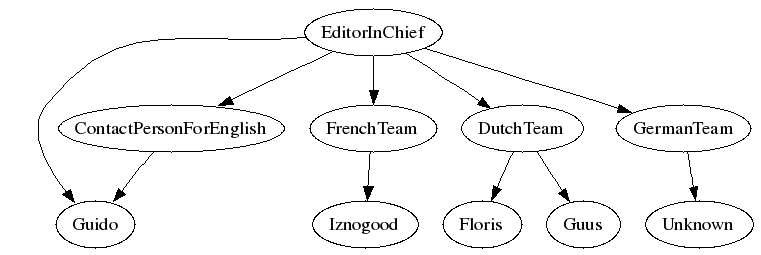
As you can see, dot aligned the team names on one line and the first names on another line. It automatically gave two arrows below the DutchTeam, for the two first names. And it automatically showed the status for Guido, although the relationships are quite far in the text file. That's a good starting point.
Now, we are going to add three authors: Guido, Iznogood and myself (JeanEtienne). Let's assume that Guido writes in English and German, that Iznogood writes in English and French and that I am writing in English and in French. Let's also assume that authors are directed by team leaders. We can continue to add relationships in the .dot file and see what happen:
digraph G {
  EditorInChief -> Guido;
  EditorInChief -> FrenchTeam;
  EditorInChief -> DutchTeam;
  EditorInChief -> ContactPersonForEnglish;
  EditorInChief -> GermanTeam;
  FrenchTeam -> Iznogood;
  DutchTeam -> Floris;
  DutchTeam -> Guus;
  ContactPersonForEnglish -> Guido;
  GermanTeam -> Unknown;
  Guido -> Guido;
  Unknown -> Guido;
  Guido -> Iznogood;
  Iznogood -> Iznogood;
  Guido -> JeanEtienne;
  Iznogood -> JeanEtienne;
}
We save it with the name "lf-hierarchy2.dot", run the command "dot -Tpng lf-hierarchy2.dot -o lf-hierarchy2.png" and we get this "graph":
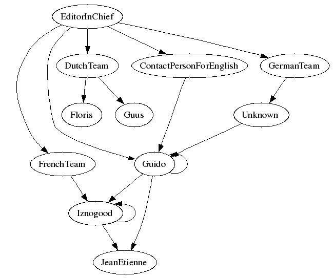
Let's face it: although dot respected all the relationships we wrote, the graph looks strange, we lost the alignement of functions, and bubbles everywhere is quite boring.
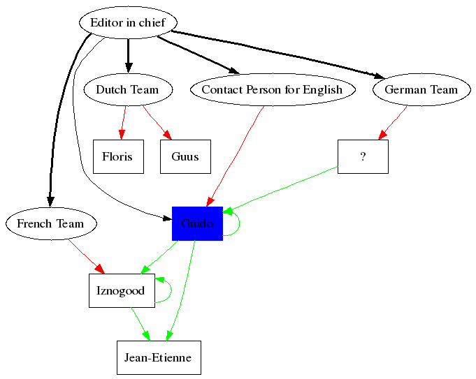
Refining some graph elements (node, edge, ...) is very easy: each customised element is followed by square-brackets ("[" and "]") containing name-value pairs of charachter strings. For example, we could write "element [option = value];". We'll use some options. Those interested in more options can read the dot user guide [6].
First, we can give different shapes for different roles. Let's keep the ellipse for abstract roles like "EditorInChief", "DutchTeam", ... but we'll use a box for real people. This is done by using this string after first names: "[shape = box]", alone on one line. For example, we'll write "Guido [shape = box];" before any use of his node.
Then, we can use different types of arrows (edges), according to whether the person is an author or a Team leader. For example, we can ask for bold lines between the EditorInChief and each team. One of the relation will then be "EditorInChief->GermanTeam [style = bold];".
We can also ask for colors ; for example, red for team leaders and green for writers. This will clarify the different relations. As you can guess, the option is, e.g., "[color = red]". We can obviously write "FrenchTeam -> Iznogood [color = red];" but we'll be obliged to write this for every relation. We can then ask that all future edges will be in red by writing "edge [color = red];".
Although we know what "EditorInChief" should mean, it will be better to write it correctly, with spaces. This is where we need the label option. "EditorInChief" will become "EditorInChief [label = "Editor in chief"];". And we can change "Unknown" in a more visual "?".
Finally, if you want to highlight the Editor in chief, you can fill his ellipse with the following option: "Guido [style = filled, color = blue];" (e.g.).
If we follow all these refinements, we end up with this text file:
digraph G {
  Guido [shape = box, style = filled, color = blue];
  Iznogood [shape = box];
  Floris [shape = box];
  Guus [shape = box];
  Unknown [shape = box, label = "?"];
  JeanEtienne [shape = box, label = "Jean-Etienne"];
  EditorInChief [label = "Editor in chief"];
  FrenchTeam [label = "French Team"];
  DutchTeam [label = "Dutch Team"];
  ContactPersonForEnglish [label = "Contact Person for English"];
  GermanTeam [label = "German Team"];

  EditorInChief -> Guido;
  EditorInChief -> FrenchTeam [style = bold];
  EditorInChief -> DutchTeam [style = bold];
  EditorInChief -> ContactPersonForEnglish [style = bold];
  EditorInChief -> GermanTeam [style = bold];

  edge [color = red]; /* defines the team leaders */
  FrenchTeam -> Iznogood;
  DutchTeam -> Floris;
  DutchTeam -> Guus;
  ContactPersonForEnglish -> Guido;
  GermanTeam -> Unknown;

  edge [color = green]; /* defines the authors */
  Guido -> Guido;
  Unknown -> Guido;
  Guido -> Iznogood;
  Iznogood -> Iznogood;
  Guido -> JeanEtienne;
  Iznogood -> JeanEtienne;
}
We save it with the name "lf-hierarchy3.dot", run the command "dot -Tpng lf-hierarchy3.dot -o lf-hierarchy3.png" and we get this fancy graph:
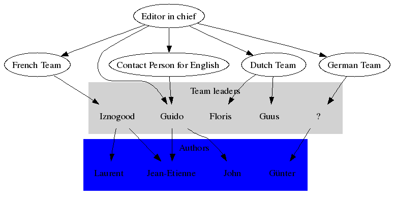
Let's go back to our first graph (the one without authors). We will now add some authors but we will assume that a Team leader cannot be an author. With that, we can group all the Team leaders in one group and all the authors in another one. This is done with the "subgraph" command that works a bit like "digraph" (it needs a name and everything is included in curly braces). One example is better (I also removed the shape around the names):
digraph G {
  subgraph cluster_team_leaders {
	  style = filled; /* defines the cluster */
	  color = lightgrey;
	  label = "Team leaders";

	  Guido [shape = plaintext]; /* defines the elements in the cluster */
	  Iznogood [shape = plaintext];
	  Floris [shape = plaintext];
	  Guus [shape = plaintext];
	  Unknown [shape = plaintext, label = "?"];
  }

  subgraph cluster_authors {
	  style = filled;
	  color = blue;
	  label = "Authors";

	  JeanEtienne [shape = plaintext, label = "Jean-Etienne"];
	  John [shape = plaintext];
	  Gunter [shape = plaintext, label = "Günter"];
	  Laurent [shape = plaintext];
  }

  EditorInChief [label = "Editor in chief"];
  FrenchTeam [label = "French Team"];
  DutchTeam [label = "Dutch Team"];
  ContactPersonForEnglish [label = "Contact Person for English"];
  GermanTeam [label = "German Team"];

  EditorInChief -> Guido;
  EditorInChief -> FrenchTeam;
  EditorInChief -> DutchTeam;
  EditorInChief -> ContactPersonForEnglish;
  EditorInChief -> GermanTeam;

  FrenchTeam -> Iznogood;
  DutchTeam -> Floris;
  DutchTeam -> Guus;
  ContactPersonForEnglish -> Guido;
  GermanTeam -> Unknown;

  Guido -> John;
  Unknown -> Gunter;
  Iznogood -> Laurent;
  Guido -> JeanEtienne;
  Iznogood -> JeanEtienne;
}
We save it with the name "lf-hierarchy4.dot", run the command "dot -Tpng lf-hierarchy4.dot -o lf-hierarchy4.png" and we get this graph:
I think this is enough to edit basic graphs with dot. If you are more interested in other options, please read the dot user guide [6].
As you've seen in the previous graphs, links (edges) between nodes were all arrows. That's why they are called "directed graphs". Now, if I want to represent a network of people without any hierarchy, I don't need those arrows. But I need another tool: neato. Neato is following a similar syntax as dot and its guide [7] is also very clear and easy to read. We will see here some basic concepts of undirected graphs.
If we get back to our "Hello World!" example, here is how to do it with neato:
echo "graph G {Hello--World}" | neato -Tpng >hello2.png
The main differences with this command line are:
As we expected, the result looks a bit like the first "Hello World" we had:
In fact, the syntax for neato is quite similar to the one used in dot (it's the same basic syntax, except for the specific option of each tool). If we take the first LinuxFocus hierarchy (lf-hierarchy1.dot) and adapt it for neato (i.e. replacing "dirgraph" by "graph" and "->" by "--"), we now have "lf-hierarchy5.dot":
graph G {
  Unknown [label = "?"];
  EditorInChief [label = "Editor in chief"];
  FrenchTeam [label = "French Team"];
  DutchTeam [label = "Dutch Team"];
  ContactPersonForEnglish [label = "Contact Person for English"];
  GermanTeam [label = "German Team"];

  EditorInChief -- Guido;
  EditorInChief -- FrenchTeam [style = bold];
  EditorInChief -- DutchTeam [style = bold];
  EditorInChief -- ContactPersonForEnglish [style = bold];
  EditorInChief -- GermanTeam [style = bold];

  edge [color = red]; /* defines the team leaders */
  FrenchTeam -- Iznogood;
  DutchTeam -- Floris;
  DutchTeam -- Guus;
  ContactPersonForEnglish -- Guido;
  GermanTeam -- Unknown;
}
If we run the command "neato -Tpng lf-hierarchy5.dot -o lf-hierarchy5.png", we get this graph:
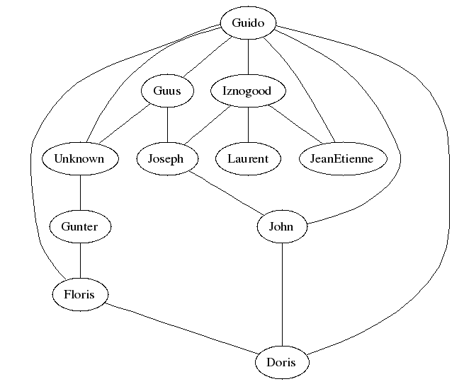
As we can see, this graph looks a bit like the first hierarchy. But neato tried to spread all the elements without any direction. Now, if I take back the authors, mix everybody and want to display only the relationships between people, I can display a graph similar to the first hierarchy, without the arrows:
graph G {
  Guido -- Iznogood;
  Guido -- Floris;
  Guido -- Guus;
  Guido -- Unknown;
  Iznogood -- Laurent;
  Iznogood -- JeanEtienne;
  Guido -- JeanEtienne;
  Guido -- John;
  Unknown -- Gunter;
  Guido -- Doris;
  Iznogood -- Joseph;
  Guus -- Joseph;
  Guus -- Unknown;
  John -- Doris;
  Joseph -- John;
  Gunter -- Floris;
  Floris -- Doris;
}
We save it with the name "lf-people.dot" and run the command "dot -Tpng lf-people.dot -o lf-people.png". Here is the result:
Now, I think that you've learned enough to build a network of computers, e.g.. And, remember, if you need help, the neato user guide [7] is very helpful.
In this article, we've learned how to create a few simple graphs with graphviz, a command-line open source graph visualization software. If you want to look further and learn more about Graphviz tools and options, then please visit the Graphviz home page [1]. You'll discover other types of graph you can do in the Gallery [8] and, if you are interested, you can find many links about the theory behind graph visualisation [9]. Finally, you can also download all the script and graphs used in this article [10].
Thanks to the Graphviz at AT&T Research for these tools!
|
Webpages maintained by the LinuxFocus Editor team
© Jean-Etienne Poirrier "some rights reserved" see linuxfocus.org/license/ http://www.LinuxFocus.org |
2005-08-13, generated by lfparser version 2.52