![[Top bar]](../../common/images/Topbar-en.gif)
![[Bottom bar]](../../common/images/Bottombar-en.gif)
![[Photo de l'auteur]](../../common/images/Yves-Ceccone.jpg)
by Yves Ceccone
About the author:
Photographer by trade, converted to computer graphics,
and hasn't let go of the mouse since.
Content:
|
Sketch, vectorial drawing under Linux
![[Illustration]](../../common/images/illustration99.gif)
Abstract:
Sketch is a vector drawing program, which is to say it
represents a figure, a circle for example, by a mathematical formula,
whereas a program such as The Gimp, a bitmap editor, uses points
(pixels).
The advantages of a vectorial representation over a bitmap are that
files will be smaller and the drawing can be enlarged significantly
without differences in rendering (pixellisation) like those you can
get with a bitmap image.
You cannot represent a photo in vector mode, but it
is possible to integrate bitmap images within Sketch (eps, jpg, gif, tiff, ...)
and import and open other formats (xfig, illustrator, corel, ...).
Without difficulty, I've opened and modified drawings created
with Illustrator 6 on a Mac and Illustrator 7 on a PC.
Sketch can also save in Illustrator format (.ai).
This article reviews the principle tools of Sketch, details the
creation of a drawing of a floppy disk, and explains some "special"
effects worthy of the big shots of vector drawing.
Installation
On the
Sketch
site, you can find the source and also the precompiled binaries
and necessary libraries as RPMs.
(I was not able to compile the program, and apparently I am not alone ;-)).
The version used in this article is 0.6.2, with RedHat 6.0.
You can also down-load
the version used for this article directly from here:
Redhat 6.0 comes with python 1.5.1. You need to install the imaging library
and the sketch rpm:
sketch-0.6.2-1.i386.rpm
python-imaging-rh-1.0b1-3.i386.rpm
Suse 6.1 comes with python 1.5.1. You
need to install the imaging library
and the sketch rpm:
sketch-0.6.2-1.i386.rpm
python-imaging-suse-1.0b1-1.i386.rpm
Debian 2.1 You need to have python-base (>= 1.5.2), the imaging library
and the sketch rpm:
sketch_0.6.2-1.deb
python-imaging_1.0.1-0pre2.deb
Principle tools

- Edit mode to modify an object.
- Select mode (to select many objects, surround them all, or click on
each one successively with "shift" pressed)

- To undo one or many actions (or "ctrl+z")
- Or redo them
- To erase an object (or "delete")

- Duplicate an object
- Horizontal flip
- Vertical flip

- Group or ungroup objects
- Place an object on top
- Place an object above
- Place an object below
- Place an object on the bottom

- Zoom
- "Snap-to" grid
- Rectangle : With "shift" pressed, draw from the centre of the
object, with "ctrl" draw a square, and with "shift + ctrl", draw a
square around the centre.
- Ellipse : Same effect with "shift" and "ctrl" keys
- Bézier curve
- Connected line
- Text tool (to make the text follow a curve, create the text,
create the curve,
select both and use the menu : effect -> path text)
With Sketch you can also vectorize a font,
which is to say transform text into Bézier curves
- Import image
Floating palettes
These palettes appear with keyboard shortcuts or through commands in
the menu, for the most part in "Windows"
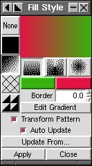
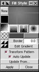
Fill Style :
You can fill a figure with a uniform background, a gradient
(linear or circular), crosshatches, a pattern (image file), or nothing.
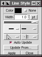
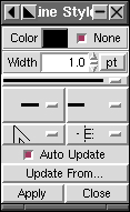
Line Style : To choose the colour of the line, its thickness,
and the sharpness of its corners and its ends.
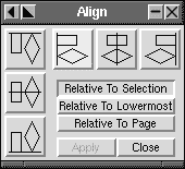
Align : Align one or more objects relative to each other (by edge, top
or centre), to the page, or to a selection.
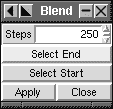
Blend : After selecting two objects of different shape and colour,
create a "gradient" from one to the other, choosing the number of
intermediate steps.
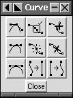
Curve :
Add a point, remove one, cut a curve in two, change a tangent ...
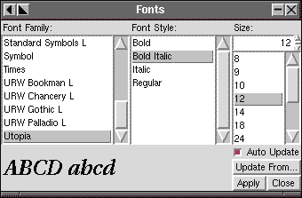
Font selector
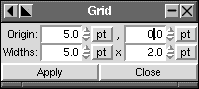
Grid : Modify the grid.
This can be made into a snap-to grid.
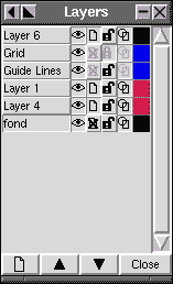
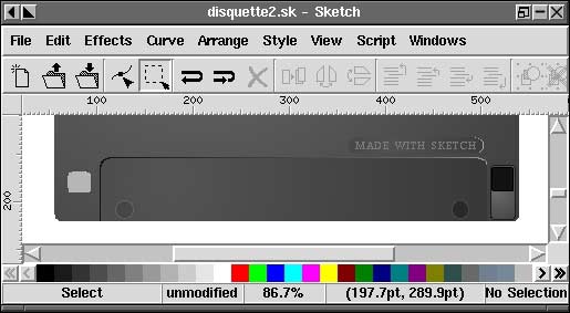
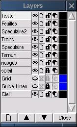
Layers : Layers ease the creation of complex drawings, since you
can block changes to a layer, go into drawing mode, change a layer object,
reorder the layers, ...
Grids and guides are also controlled with this palette.
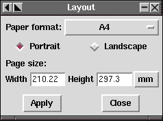
Page layout
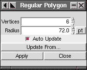
Regular polygons
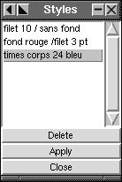
Styles : Create a style (colour, line width ...) and
apply it to many objects without the need to apply all the changes with the
individual tools.
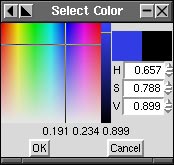
Colour selection
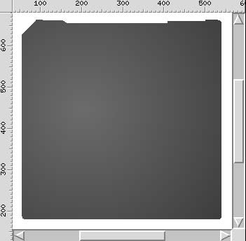
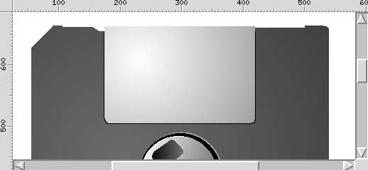
Floppy Disk
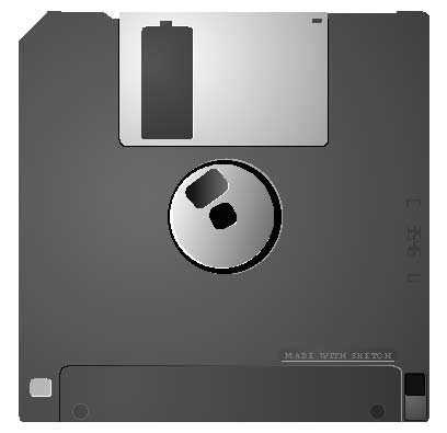
The jagged contours that you see, particularly the circular parts, are an
artifact of the screen. This effect diminishes when you zoom and
disappears completely on printing. You can download the floppy disk in
sketch format here, if that helps.
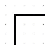
When you start Sketch, it creates an empty document (in A4) by default.
"F5" opens the Layer palette, and to make the grid appear you must ensure
that the eye beside "Grid" is open.
Modify the width of the grid :
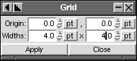
The body
Set the grid as "snap-to", then draw a square about the size of the page
with the rectangle drawing tool (while pressing "ctrl" for squareness),
starting on one point of the grid and finishing on another.
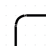
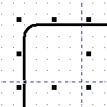
After zooming on the top left corner, click with the edit tool
on the point in the corner and pull inward to round all four corners
at the same time :
Still in the same corner, add guide lines 5 units from the corner both
horizontally and vertically
(by "dragging" the respective rulers):
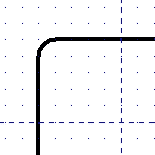
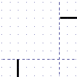
Next, lock the layer "Guide Lines" (with the padlock)
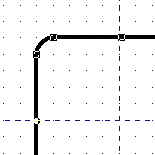
Convert the line to a Bézier curve using the menu Curves -> Convert to Curve
Open the palette Windows -> Curves Commands
With the edit tool, click on one of the
guide-line/rectangle intersections
and a point will appear. Now click on the "Cut Curves" tool on
the top right of the Curve palette.
Do the same for the other intersection
Then use Curves -> Split Béziers to separate the two parts,
and select (with the selection tool) the piece with the corner and delete it.
You could join the loose ends, but in this case it isn't useful.
With the "Insert Nodes" tool (in the centre of the Curve palette) add
3 points to the line.
With the edit tool you can move these points, and with the aid of the
snap-to grid for the horizontal and vertical, you can easily make the
outline you need.
... The floppy disk outline is now finished ...
Open the "Fill style" and "Line style" palettes
With the outline of the floppy disk selected, click on "None" in the
"Line style" palette to remove any thickness from the outline.
In "Fill style" click in the first column with the third button (gradient)
then on the third gradient type (circular), then on Edit Gradient. You
can also set the colours for the gradient with the two buttons under the
gradient types.
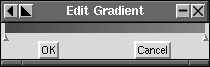
In the Edit Gradient dialog box you can modify the color of a point on the gradient,
add a new point, and of course move the points.
With a circular gradient, you can choose the center of the gradient with
the mouse.
Once you have created your gradient and selected the figure to which you
want to apply it, click "Apply" :
You can now lock the layer "Body" and create another with the icon on the
bottom right of "Layers"
This layer is destined for the center of the floppy disk.
By default a newly created layer is placed above the others; you can modify
the level of a layer with the arrows on the bottom of the "Layers" palette.
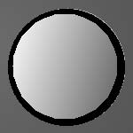
The axis
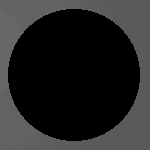
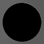
Draw a circle at the center of the floppy disk body (use the "alignment" box
to centre it) and fill it with black.
Duplicate this circle and fill it with a very light gray and place it under
the first using the "place underneath" icon in the tool palette.
To give the effect of light from the left, you must shift the light circle
to the right, deforming it a little by pulling on the little squares around
it while it is selected.
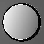
Duplicate the black circle again then shrink it using the mouse with "ctrl"
key pressed (to keep its shape).
Fill it with a linear gradient going from a light gray to a dark gray,
duplicate it and place it underneath filled with white, shifted and
elongated on the left.
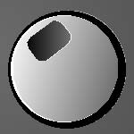
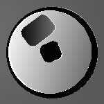
For the two little cutouts use rectangles with rounded corners (same method
as for the body), filling one with black and the other with a gradient,
and add the reflections which give them volume.
Slider
You can of course create a new layer for this part ...
The metal slider consists of a rectangle with rounded corners on the
bottom only, made by cutting off the top half of the figure, like you saw
above with the "Cut curve" tool in the Curve palette.
To give a metallic effect, fill the object with a circular gradient
light gray/dark gray shifting the centre of the gradient to the left.
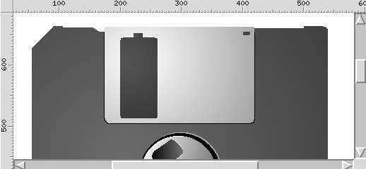
To give the effect of the cutout in the slider you must use the same gray
as in the body to fill the rectangles on this part.
And of course add a "sliver of light" by duplicating these elements and
placing them under the original after having filled them with light gray
/ white.

Make a copy of the slider that you will transform to create the indentation
and its lighting effects, then make the slot with a black rectangle.

The other elements are made from half circles, deformed circles and rectangles
with rounded corners.
A half circle is easily made by selecting a circle in edit mode and
moving the lone point which appears.
Bottom and the text
Use the same method for the other elements, rectangles, circles ...
For the text, click with the text tool where you want to place it, in the
text palette, choose the typeface, the style, and the colour. The area
around the text is a rectangle with rounded corners.
The vertical text on the right hand side is made by going to the menu
edit -> create -> LCD text : You must enter the text, the style, "Apply",
you may also change the size, the colour, ..., and
to rotate it to 90° double-click on the object which brings up arrows
that allow rotation. Use the arrows in the corners here, as the others
serve to deform the object.
Sunset
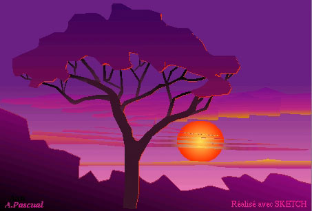
A contribution from André Pascual.
You can clearly see the structure of the drawing in the Layers palette
[and even more clearly if you recognize that feuilles=leaves,
speculaire=specular reflection, tronc=trunk,
nuages=clouds, soleil=sun, ciel=sky].
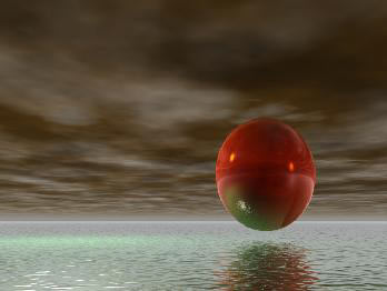
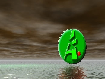
Volume effects / Blend
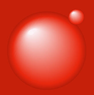
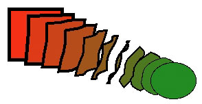
This effect is realized with the blend tool (effect -> blend), which
I think of as a shape gradient.
Principle: you can clearly see on the right that the square is transformed
to a circle step by step and that its colour is also modified with each
step.
Select two objects, then you choose the number of steps for the blend.
The more steps you choose, the more smooth and
realistic the effect. With 200 steps, you can create the semblance of a
sphere from a large coloured circle and a very small white circle above it.
For the example above, I used 3 "blend" effects together (6 objects, 2 by 2).
Blend only works with two objects, and the result cannot be combined with
another "blend" or an object. But it is possible to modify it by selecting certain
parts, to change the steps or the colour.
Text following a curve
For this effect it suffices to select a figure and some text and use
the menu Effects -> create path text.
The text
will automatically follow the curve, no matter what its shape.
Vectorized text
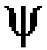
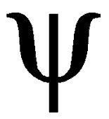
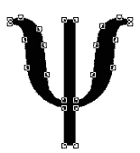

Vectorizing text (here a "y" in the symbol font) transforms it
into an object, that is, a vectorized curve modifiable by pulling on
its points and with the help of the "Curves" dialog box.
For that you must, once you have the text selected, use the menu
Curve -> Convert to Curves, and then to make it editable, ungroup it
with Arrange -> Ungroup.
This can be useful if you must provide a drawing to someone who does not have
the fonts you've used on their machine; you vectorize the text and that
person will be able to open the drawing without problem.
To be able to vectorize a font, Sketch must find the corresponding
font file .pfb, for that I put this file in the directory
/usr/lib/sketch-0.6.2/Ressources/Fontmetrics.
Import / Mask
With the menu Edit -> Create -> Load image (or the last icon on the right
in the menu), you can import a bitmap image.
It is possible to resize the image.
With the menu File -> Insert Document, you can insert in a drawing
a file from
Sketch, Corel, Svg, ... or illustrator as is the case in this example.
The cropping was done with the menu
Effects -> Create Mask Group on a rectangle defined in the original
image.
What's to come
We often compare Gimp to photoshop (it compares favourably),
and I can't help thinking that Sketch will be the
Gimp of drawing programs, and that it will be the
equal of Illustrator, Freehand, or Corel Draw... eventually.
1999-11-01, generated by lfparser version 0.8