![[LinuxFocus Image]](../../common/images/border-short.jpg)
| News Archives Map |
|
|
|
|
|
by Phil Ross <phil(at)ryoko.cis.pitt.edu> |
Creating Text with The GimpAbstract:
This month our Gimp article explores the creation of text banners.
|
Hello again, Gimp artists. Here is the second Linux Focus article on using GIMP. In this issue Manuel concentrated on using layers in Photoshop to create some neat effects with text. Luckily GIMP has seen much developement over the past year or so, and its ability to manipulate layers is one if its strong points. And while I have the chance, I would like to plug a very good website that allows me to keep up with the most recent versions of GIMP: http://freshmeat.unreal.org Everytime a new version of GIMP, GTK, or any other Linux software is released, freshmeat mentions it almost immediately. It's a well organized and layed-out site with some really nice functionality. Fire up your browser and check it out!
So, without further ado, let's see which GIMP tools can be used to parallel the Photoshop tools that Manuel used in his article.
In our last GIMP article we attempted to get familiar with the Layers & Channels dialog box. This dialog box is what we are going to be using to achieve our affects. We mentioned last time how to get to the Layers &Channels dialog box and generally what the layout was, but we might as well go over it real quick again to refresh some of our memories.
 OK, at the top we have the Image menu. In GIMP, when you have
more than one image open, you can use this menu to choose which image the
Layers & Channels dialog box will be manipulating. Below that we have two
seperate tabs, the Layers tab and the Channels tab. The Channels tab
allows us to view and manipulate seperate color channels, while the Layers
tab is what we will be using to manipulate the layers of our image.
Straight forward enough, right? We won't mention the Channels tab any
more in this article as we won't be using it (You are urged to experiment
with it on your own though!!!)
OK, at the top we have the Image menu. In GIMP, when you have
more than one image open, you can use this menu to choose which image the
Layers & Channels dialog box will be manipulating. Below that we have two
seperate tabs, the Layers tab and the Channels tab. The Channels tab
allows us to view and manipulate seperate color channels, while the Layers
tab is what we will be using to manipulate the layers of our image.
Straight forward enough, right? We won't mention the Channels tab any
more in this article as we won't be using it (You are urged to experiment
with it on your own though!!!)
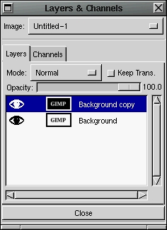
So let's look at the Layers tab now. At the uppermost section of the Layers tab we see the Mode menu. This is a drop-down menu that provides us with a lot of ways to operate on a particular layer. This menu can be a lot of fun to experiment with. The "Keep Trans." button is for retaining transparency in a layer while manipulating it. The Opacity slide-bar, as we covered in the last article, controls the opacity of the layer, or in other words it controls to what degree the image is transparent. See last issues article for a full explanation. Below that is where our layers are displayed. On the leftmost part of this list there are eyeball icons. These control whether a layer is visible or not. If the eyeball is displayed there, the layer is visible, otherwise the layer is invisible. Beside that to the right, there may or may not be icons of a 4 direction cross. These are off on all layers by default, but clicking in the little white space will turn these on. They are to control which layers are to be moved during a move operation. Beside that there is a mini view of the layer itself. You can use that to vaguely see what your layer looks like all by itself. To the right of that is the layer title. You can change the title by double-clicking on the title and a new window will pop up to allow you to change it. In the last article we also discussed the Layers & Channels dialog box menu. You can get to this menu by right-clicking on a layer title.
So now that were are kind of familar with the Layers & Channels dialog box, let's play with some layers. Open a new image with a white background. Choose the color black and throw down some text. Then open the Layers & Channels dialog box and right-click on the title to get the menu. From the menu choose Duplicate Layer. This will simply make another layer of the image that contains the exact same thing. We now want to see what the Mode menu can do for us. Click on the upper layer in the layer list and go to the image box and use the menus to choose Image->Colors->Invert. This will reverse all the colors within that layer. Now we have two layers that are exact opposite. Let's use the menus to choose Filters->Blue->Gaussian Blur(IIR) and use a value of 3 or 4 for the blur.
Now that we have two layers which are opposite of each other, one being slightly blurred, we go back to the Layers & Channels dialog box to try out some of the mode settings. Each layer can have its own Mode setting, and the layer's mode setting controls how it is mixed in with all the rest of the layers below it. The default is NORMAL which just takes the layer and puts it over top of the layers below it. NORMAL mode only allows lower layers to peep through where the current layer might have transparent pixels (or some with opacity lower than 100%). So what we want to do is click on the upper layer in the list so we can control how the upper layer is mixed with the bottom layer.
If you just experiment and choose different modes from the menu, you'll see how each Mode changes the operation used to mix the layers. I'm not going to explain to you exactly what each mode is doing, as that would take far too long. This is where knowing color theory will help you out. Here are samples of some modes:
Addition: |
Darken Only: |
Difference: |
Lighten Only: |
Multiply: |
Subtract: |
Some of these results may look the same but if you look closely they are all different. In Manuel's article he mention's Photoshop's Soft Light operation. The Lighten Only operation in GIMP is close to this. If you use the Lighten Only mode you will get a result much like the soft black and white Linux Focus logo in Manuel's article.
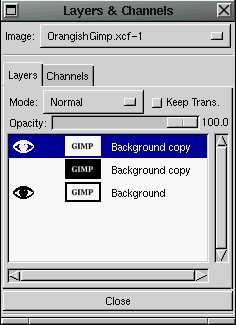 We can add the yellowish coloring with a few more steps. Go to the Layers
& Channels dialog, activate the layer that has the black text on the white
background. Right click on the title to pull up the menu and choose
Duplicate Layer, and a duplicate will be made. Activate this duplicate
layer and use the Raise layer option from the menu to move it to the top
of the layer list.
We can add the yellowish coloring with a few more steps. Go to the Layers
& Channels dialog, activate the layer that has the black text on the white
background. Right click on the title to pull up the menu and choose
Duplicate Layer, and a duplicate will be made. Activate this duplicate
layer and use the Raise layer option from the menu to move it to the top
of the layer list.
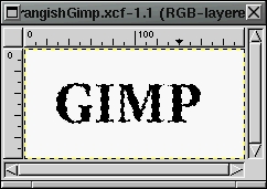
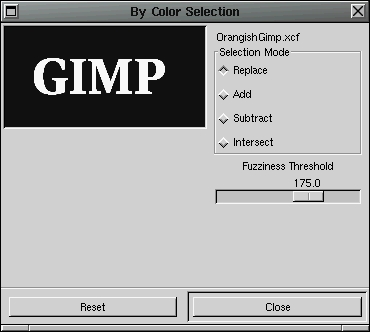
Now that we have a layer to add color to, go back to the image box and choose Select->By Color to bring up the Select By Color dialog. Click the Replace selection mode and move the Fuzziness Threshold slide bar up to about 175.0 or so. Now click in the box on one of the text letters. Your box might be completely black, but when you click inside it the letters will appear. You can then click on one of the letters which will select all pixesl on the screen that are the same color as the pixel you clicked on. Actually, because we raise the fuzziness threshold, pixels that are close in color will also be selected. In affect, we are able to select all the letters.
 |
 |
 We have a region of the layer selected, so now we can add the color. Go
to the toolbox and use the palette to choose a yellowish color. Pick the
paintcan from the toolbox, go to the image box, and click anywhere inside.
The selected region, which should only be the letters of the text, should
be colored yellow. If not, you might have done something wrong such as
not had the correct layer activated in the Layers & Channels dialog box.
Make sure the topmost layer is activated...this can be
tricky!
We have a region of the layer selected, so now we can add the color. Go
to the toolbox and use the palette to choose a yellowish color. Pick the
paintcan from the toolbox, go to the image box, and click anywhere inside.
The selected region, which should only be the letters of the text, should
be colored yellow. If not, you might have done something wrong such as
not had the correct layer activated in the Layers & Channels dialog box.
Make sure the topmost layer is activated...this can be
tricky!
After we have this layer containing the yellowish colored text,
 go back to the Layers & Channels dialog box and choose the MULTIPLY Mode
for the yellow-text layer. If all of the layers are visible, the image box
should now show our text with yellowish coloring to the center with a
softly darkened border. We can go to the Layer & Channels dialog box,
pull up the menu on any of the layers, and choose Merge Visible Layers.
This will combine all of the layers into one layer and set the mode of the
this new merged layer to NORMAL. If you want to get rid of
the white background and make it transparent, use the Select
By Color dialog to select the text again, invert the selection, then
Edit->Clear to clear the selected region. This will leave
you with text and a transparent background.
go back to the Layers & Channels dialog box and choose the MULTIPLY Mode
for the yellow-text layer. If all of the layers are visible, the image box
should now show our text with yellowish coloring to the center with a
softly darkened border. We can go to the Layer & Channels dialog box,
pull up the menu on any of the layers, and choose Merge Visible Layers.
This will combine all of the layers into one layer and set the mode of the
this new merged layer to NORMAL. If you want to get rid of
the white background and make it transparent, use the Select
By Color dialog to select the text again, invert the selection, then
Edit->Clear to clear the selected region. This will leave
you with text and a transparent background.
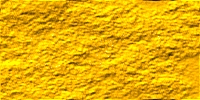
For a really nice effect, instead of using a top layer with a
solid color, use a texture. Here's how I made mine. I was using three
layers in my demonstration above. The bottom one had a white background
with black text. The middle layer had a black background a white text, and
was slightly blurred. The top layer had a white background and yellow
text. I activated the top
layer and duplicated it. I took the upper duplicate and chose
Filters->Render->Plasma from the menu in the image box and used a seed of
5 and a turbulence of 2.
 This rendered a texture in the uppermost
duplicate. I then activated the layer with the white background and
yellow text, and then I selected the entire image box region and used the
paintcan to set the entire layer to a solid yellow color. I then chose
Filters->Map->BumpMap from the imagebox menu to bring up the Bump Map
dialog box. I then chose the rendered plasma layer for the bump
map, played with the other settings until I had a nice textured
layer, then hit OK. This changed my solid yellow layer to a textured
yellow layer. I then went to the Layers & Channels dialog box,
right-clicked on the title of the plasma layer and chose delete to get rid
of that layer...it was no longer needed.
This rendered a texture in the uppermost
duplicate. I then activated the layer with the white background and
yellow text, and then I selected the entire image box region and used the
paintcan to set the entire layer to a solid yellow color. I then chose
Filters->Map->BumpMap from the imagebox menu to bring up the Bump Map
dialog box. I then chose the rendered plasma layer for the bump
map, played with the other settings until I had a nice textured
layer, then hit OK. This changed my solid yellow layer to a textured
yellow layer. I then went to the Layers & Channels dialog box,
right-clicked on the title of the plasma layer and chose delete to get rid
of that layer...it was no longer needed.
 Then I right-clicked on the
yellow texture layer and chose the Add Layer Mask. In the Add Mask
options I left the default setting at White (Full Opacity). I then
activated the layer with the black background and white text. I chose
Edit->Copy from the imagebox menu, activated the yellow texture layer with
the mask and chose Edit->Paste in the image box menu. I then chose
Layers->Anchor Layer from the image box menu to set the pasted layer down
in the masking layer. I then made sure the yellow texture layer was
activated and chose Apply Layer Mask from the Layers & Channels dialog box
to apply the layer, which masked out everything but the textured text.
Now all that needed done was to Merge Visible Layers from the Layers &
Channels dialog box. This all may seem like a lot of work, but it gets
very easy if you practice!
Then I right-clicked on the
yellow texture layer and chose the Add Layer Mask. In the Add Mask
options I left the default setting at White (Full Opacity). I then
activated the layer with the black background and white text. I chose
Edit->Copy from the imagebox menu, activated the yellow texture layer with
the mask and chose Edit->Paste in the image box menu. I then chose
Layers->Anchor Layer from the image box menu to set the pasted layer down
in the masking layer. I then made sure the yellow texture layer was
activated and chose Apply Layer Mask from the Layers & Channels dialog box
to apply the layer, which masked out everything but the textured text.
Now all that needed done was to Merge Visible Layers from the Layers &
Channels dialog box. This all may seem like a lot of work, but it gets
very easy if you practice!
We can use a few GIMP tools to create the same illuminous effect as Manuel did by using almost an identical procedure. We use the Select By Color with a high treshhold to select all of the background (even inside letters like P and O), then use the Select->Shrink to bring the select region away from the border of the text. I only used a shrink value of 2, because we dont want it too far away. Then use Select->Feather to smooth out the selection (I use a feather value of 5). Next choose a reddish color from the palette and the paintcan from the toolbox. Click inside the image box and the entire highlighted region will be painted with this red color. Next we want to shrink the select region again and feather it. I used the same values for shrink and feather as I did before. The values will probably need to be be different depending on the thickness of your text font and personal preference. It might be good to set a high Undo level value so you can go through all these procedures, judge the final result, and if you dont like it you can keep using the undo command to go back to the beginning of the procedure. The levels of Undo setting can be found by going to the File menu in the toolbox, choosing the Preferences options, and clicking on the Interface tab in the Preferences dialog box.
|
Webpages maintained by the LinuxFocus Editor team
© Phil Ross, FDL LinuxFocus.org |
Translation information:
|
2002-11-02, generated by lfparser version 2.34